The Hertzsprung-Russell Diagram
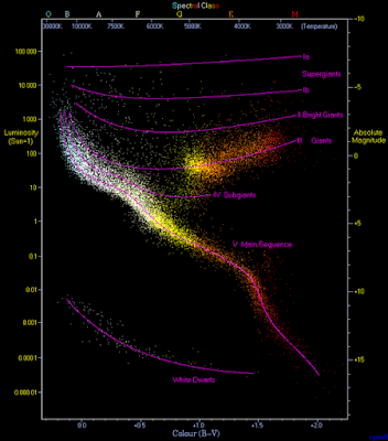
If you were to understand only one thing about stellar structure and evolution, it ought to be the Hertzsprung-Russell diagram. It's a simple idea - a plot of the absolute luminosity (brightness) of stars against their surface temperature (often captured via their color, as measured by their relative brightness in two bands, the blue (B) minus the visual (V).) Below is a version, from the Wikipedia link, due to Richard Powell.
The most obvious feature of this diagram is the non-random distribution of the stars, with most of them being concentrated near a slightly curved line from lower right (low luminosity versus red color and low temperature) to upper left (high luminosity versus blue color and high temperature). This line is the main sequence, and consists of stars burning hydrogen in their cores, which is how they spend most of their lives. There is also a more diffuse blob of stars to the right of the main sequence, consisting of bright and cooler stars inhabiting the various types of giant categories. These have moved off the main sequence and are no longer burning hydrogen in their cores, and as their category names imply, are much larger than main sequence stars. Finally, there is another curve in the lower left of faint, hot stars, the white dwarfs, which are remains of stars having exhausted their nuclear fuel, and which have the mass of small main sequence stars but a million times less volume.
Note the vast range of luminosity among the hydrogen burning stars, from only one ten-thousandth of the Sun's luminosity to 100,000 times as bright, or nine orders of magnitude. The brightest stars are burning up their hydrogen a billion times as fast as the dimmest.

Comments
Post a Comment